Webseite optimieren: Auf einen Blick verstehen, wofür das Unternehmen steht (Beispiele DAX 40 Unternehmen)
Kennst du das: du rufst eine Website auf und hast keine Ahnung, wofür das Unternehmen eigentlich steht? Klare Inhalte sind ein wesentlicher Baustein für erfolgreichen Website Content. Klarheit sorgt im Content Marketing nicht nur für eine bessere User Experience, sondern erhöht zudem auch die Vertrauenswürdigkeit des Unternehmens.
Ziel: Klarheit
Klarheit ist ein Vertrauensbaustein, der auf die Aura des Unternehmens einzahlt. Dies betrifft Unternehmen jeder Größenordnung. Es kann die Website des Arztes sein, bei der ich nicht sehen kann, ob der Arzt für meine Krankheit überhaupt das notwendige Fachwissen hat. Oder die Methoden einsetzt, auf die ich schwöre. Oder der DAX Konzern, dessen Aktien ich vielleicht kaufen möchte. Und was macht das Unternehmen doch gleich?
Klarheit ist eine unabdingbare Voraussetzung für Vertrauen in den Anbieter, zu dem ich noch keinen persönlichen Kontakt hatte. Ohne Klarheit in der Kommunikation funktioniert der Aufbau einer vertrauenswürdigen Verbindung nicht. Und ich bin ganz schnell wieder weg von der Website.
Es ist auch kein Wunder, dass die durchschnittliche Verweildauer auf Websites extrem kurz ist. Oft nur wenige Sekunden. Dies hat häufig nicht zur Ursache, dass der User erkennt, dass er beim falschen Unternehmen ist. Häufig erkennt er schlicht nicht, dass er beim richtigen ist. Die Kommunikation ist diffus. Der User ganz schnell wieder weg.
Ein wesentliches Ziel für den Website Content muss daher sein, sehr klar und schnell die wesentlichen Inhalte zu kommunizieren. Und was gibt es Wesentlicheres als die Frage, was das Unternehmen ausmacht, für welche Produkte und Dienstleistungen es steht und dazu vielleicht noch ein bis zwei weitere wichtige Positionierungspunkte?
Positive und negative Beispiele aus dem DAX 40
Bei kleinen und mittleren Unternehmen erlebe ich es immer wieder, dass die Inhalte nicht klar sind. Texte werden hier häufig nicht von Profis verfasst. Es ist daher nicht verwunderlich, dass Optimierungspotenzial vorhanden ist.
Anders sollte es bei den wichtigsten deutschen Firmen sein, die im DAX40 zusammengefasst sind. Jedoch: Gerade große Unternehmen glauben gerne, dass sowieso jeder wüsste, wofür das Unternehmen steht. Doch dies ist eine grobe Fehleinschätzung. Nehmen wir das Beispiel mit dem potentiellen Aktionär. Eine wichtige Zielgruppe, die kein DAX-Unternehmen so einfach außen vor lassen möchte. Er hat aber zunächst keine Idee davon, wofür Symrise, Sartorius, Qiagen oder Vonovia eigentlich stehen (ja, die gehören zu den wichtigsten deutschen Unternehmen). Und selbst bei Siemens oder Mercedes-Benz ist es nicht so einfach aus dem Stehgreif zu sagen, welche Produkte und Services aktuell sind.
Die Mercedes-Benz Group macht es sehr gut. Die zwei prägnanten Sätze bringen es auf den Punkt. Ansonsten kein Schnick-Schnack. Alles weitere folgt auf den Unterseiten. So sieht Klarheit aus. Warum der Jahresbericht mit einer englischen Überschrift angeteast wird, bleibt allerdings offen.
 |  |
Auch die Vonovia kommt schnell auf den Punkt.
 |  |
Und ebenso gut ist der Einstieg bei Continental. Man sollte meinen, das müsste eigentlich immer so sein. Doch leider ist dies nicht so.
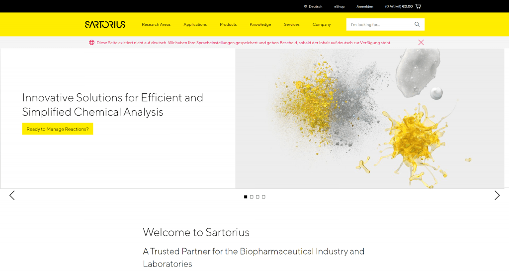
Bei Sartorius (ebenso bei Qiagen) scheitert es schon mal daran, dass die Funktionalität zur Umschaltung des Inhalts auf die deutsche Sprache nicht funktioniert. Für ein DAX 40 Unternehmen ist das schon peinlich.
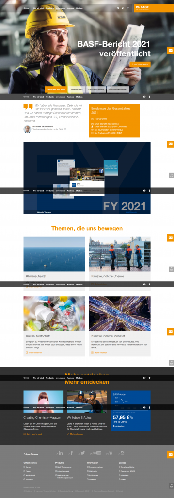
Aber macht BASF wirklich nur noch Klimaschutz, Elektromobilität und Kreislaufwirtschaft? Etwas anderes ist auf der Homepage nicht zu finden.
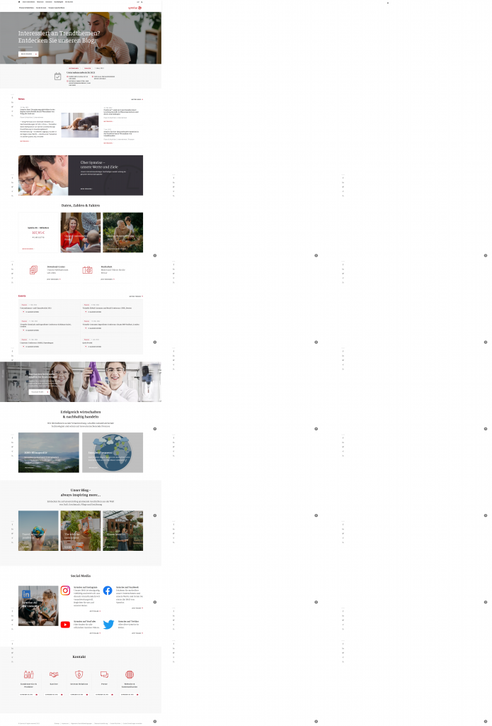
Und wer es nach der Ansicht der Homepage von Symrise schafft, mir zu sagen, was das Unternehmen eigentlich macht, bekommt 100 Punkte.
„Unsere Unternehmensstrategie: Nachhaltiges Handeln entlang der gesamten Wertschöpfungskette“ – Aha.
„Wir übernehmen soziale Verantwortung, schaffen zukunftsweisende Technologien und setzen auf ressourcenschonende Prozesse“ – Jetzt klar geworden?
„Entdecken Sie auf unserem Blog spannende Geschichten aus der Welt von Duft, Geschmack, Pflege und Ernährung“ – immerhin. Da wird zumindest grob klar, in welchen Bereich das Unternehmen gehört. Aber wissen Sie jetzt, was es genau tut? Ich nicht.
Es fängt bei der Marke an
Eigentlich ist es ganz einfach. Die Marke sollte die Eigenschaften des Unternehmens abbilden. Und möglichst klar zeigen, wofür das Unternehmen steht. Die Umbenennung der Daimler AG in Mercedes-Benz Group ist nach der Abspaltung von Daimler Truck konsequent und vorbildlich.
Auch der Claim von BASF „We create chemistry“ lässt an Klarheit nichts zu wünschen übrig.
Ganz anders bei Henkel: „Das Leben neu gestalten & bereichern. Jeden Tag.“ Mit Klebstoff, Mundpflege und Reinigungsmitteln? Da braucht es schon viel Phantasie.
Hier hat jedes Unternehmen die Chance zu überprüfen, ob die eigenen Werte adäquat und zeitgemäß in der Marke abgebildet sind.
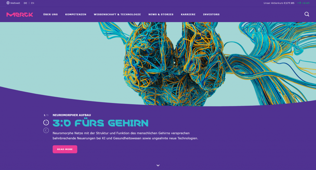
Das Corporate Design von Merck muss nicht jedem gefallen. Aber innovativ ist es alle mal und strahlt dies auch für das Unternehmern aus.
Fremdwörter und unternehmenseigenes Wording verwirren
Dass ich rein englische Websites für in Deutschland gelistete Börsenunternehmen nicht für angemessen halte, hatte ich schon erwähnt. Aber auch das Denglisch auf vielen Websites ist häufig nicht nur unnötig, schon gar nicht „cool“ und im Zweifel nicht jedem User klar verständlich.
Dies lässt sich auf alle Länder und Sprachen übertragen. Selbstverständlich kommen im B2B Business die allermeisten User mit Englisch gut klar. Wenn dir ein Land aber wichtig ist, sorgt es im Zweifel für ein wesentliches Plus an Klarheit, wenn du deine Website auch in der Landessprache zur Verfügung stellst. Frankreich ist ein schönes Beispiel, wo man keineswegs damit rechnen kann, dass jeder Englisch spricht. Und in China schon dreimal nicht.
Die Verwendung von Fremdwörtern und unternehmenseigenen Sprachschöpfungen ist eine weitere Unsitte. Hierzu zählen auch Abkürzungen, die außerhalb des eigenen Unternehmens kaum jemand versteht. Die Marketing- und Internetbranche ist da natürlich ein Paradebeispiel. Aber auch wir bemühen uns um die deutsche Sprache. Dass das nicht immer hinhaut, siehst du an der Überschrift dieses Absatzes, die ich nun bewusst so stehen lasse ;-).
In Workshops erlebe ich es sehr häufig. Wir sammeln Keywords für die einzelnen Webseiten. Die Wörter, die ich hierbei zu hören bekomme, sind regelmäßig erst auf Nachfrage klar. Überprüfe daher die Worte, die in eurem Unternehmen verwendet werden. Und im Zweifel kommuniziere lieber einfacher .
Gut gemeintes Design als Falle
„Form follows funtion.“ – ein uralter Leitsatz für Design aller Art. Leider schon immer und nach wie vor häufig missachtet. Design ist nicht per se dafür da gut auszusehen. Es umkleidet Inhalte. Im Internet Texte, Bilder, Grafiken und Videos. In selbstverständlich einer möglichst schönen und für das Unternehmen passenden Art und Weise.
Auf Homepages waren lange große Bühnen mit einem Slider im sofort sichtbaren Bereich angesagt. Großer Nachteil: Niemand wartet bis der Slider durchgelaufen ist. Das bedeutet, dass wichtige Inhalte, die extra ganz oben im Slider platziert wurden, dort nicht gesehen werden. Auch werden diese Slider häufig mit News oder aktuellen Promotions direkt am Anfang bestückt. Wenn du also einen solchen Slider hast, denke daran, die wichtigsten Inhalte zum Unternehmen auch darunter als Textblock einzusetzen.
Warum deine Agentur für Suchmaschinenoptimierung / SEO nicht immer hilft
Wenn du deine Homepage suchmaschinenoptimiert anlegen möchten, wird dir deine SEO Agentur sicher sagen, dass die wichtigsten Keywords zum Beispiel in der h1 Überschrift stehen müssen. Da hat sie recht.
Außerdem gibt es weitere Hinweise, gerade bei der Homepage. Diese hat am ehesten die Chance auch für mehrere gute Keywords hoch zu ranken. Daher bekommen Sie ein ganzes Sammelsurium an Wörtern und Wortkombinationen, die du in den Text einbauen sollest.
Wichtig ist es hier, an den User bzw. Leser zu denken. Denn nur für ihn machst du das alles. Wenn die Seite zwar alle Keywords enthält, die User aber alle wegen des daraus resultierenden sprachlichen Kauderwelsch gleich wieder weg sind, ist niemandem geholfen. Der Leser hat im Zweifel Priorität für die Suchmaschinenoptimierung.
6 Tipps für Klarheit im Website Content
- Stelle die Tätigkeit des Unternehmens in maximal drei Sätzen im sofort sichtbaren Bereich der Homepage dar
- Vermeide Fremdwörter und unternehmenseigenes Wording
- Zeige mit eurem Unternehmensnamen, der Marke, dem Corporate Design und eurem Slogan die Kernwerte und Tätigkeiten des Unternehmens auf
- Setze die SEO Keywords nur so ein, dass die Klarheit für deine User nicht leidet
- Biete deine Inhalte in den wichtigsten Landessprachen für deine Zielregionen an
- Erstelle zuerst das inhaltliche Konzept, und erst dann das Design
Website Check: Es muss nicht die Putzfrau sein – kann aber
Der hier beschriebene Test hieß früher „Putzfrauentest“. Hintergrund ist die Idee, jemand vollkommen Unvoreingenommenes ein Werbemittel oder eine Website checken zu lassen. Probiere es doch einfach mal aus.
Überlege dir ein paar Fragen, die deine potentiellen Kunden haben könnten. Welche Produkte bietest du an? Wie lang sind die Lieferzeiten? Gibt es Ansprechpartner vor Ort? Oder was auch immer in deiner Branche relevant ist.
Und dann lässt du Menschen am PC oder auch am Handy mit diesen Fragen auf deine Website schauen. Es kann ruhig die Reinigungskraft im Büro sein. Oder der Nachbar zuhause. Du wirst überrascht sein, auf welche Hürden diese Versuchspersonen alles kommen.
Fazit
Klarheit ist enorm wichtig, um das Vertrauen von Neukunden zu erhalten. Es lohnt sich darüber nachzudenken, wie du deinen Website Content so einfach wie möglich aufbaust.